top of page


Hospitality Branding
Spring 2021
Apo Reef Resort
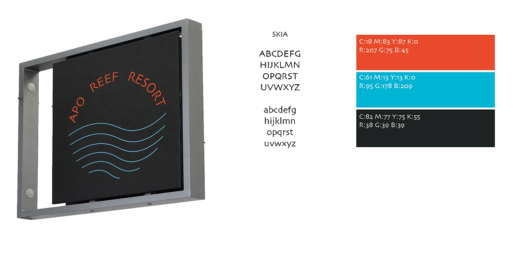
Apo Reef Resort is positioned as a resort that pays attention to environmental protection. The brand's logo is composed of a scene of a sunset over the sea through minimal lines and the type, and the minimalist style is consistent with the hotel's décor. The color is extracted from the blue of the sea and the orange from golden hour. In addition, the resort's room key is in the form of a wristband for guests to enjoy the resort in a more portable way.


bottom of page